
Neons. On preserving the endangered type.
Date : Friday 30 September, 2016
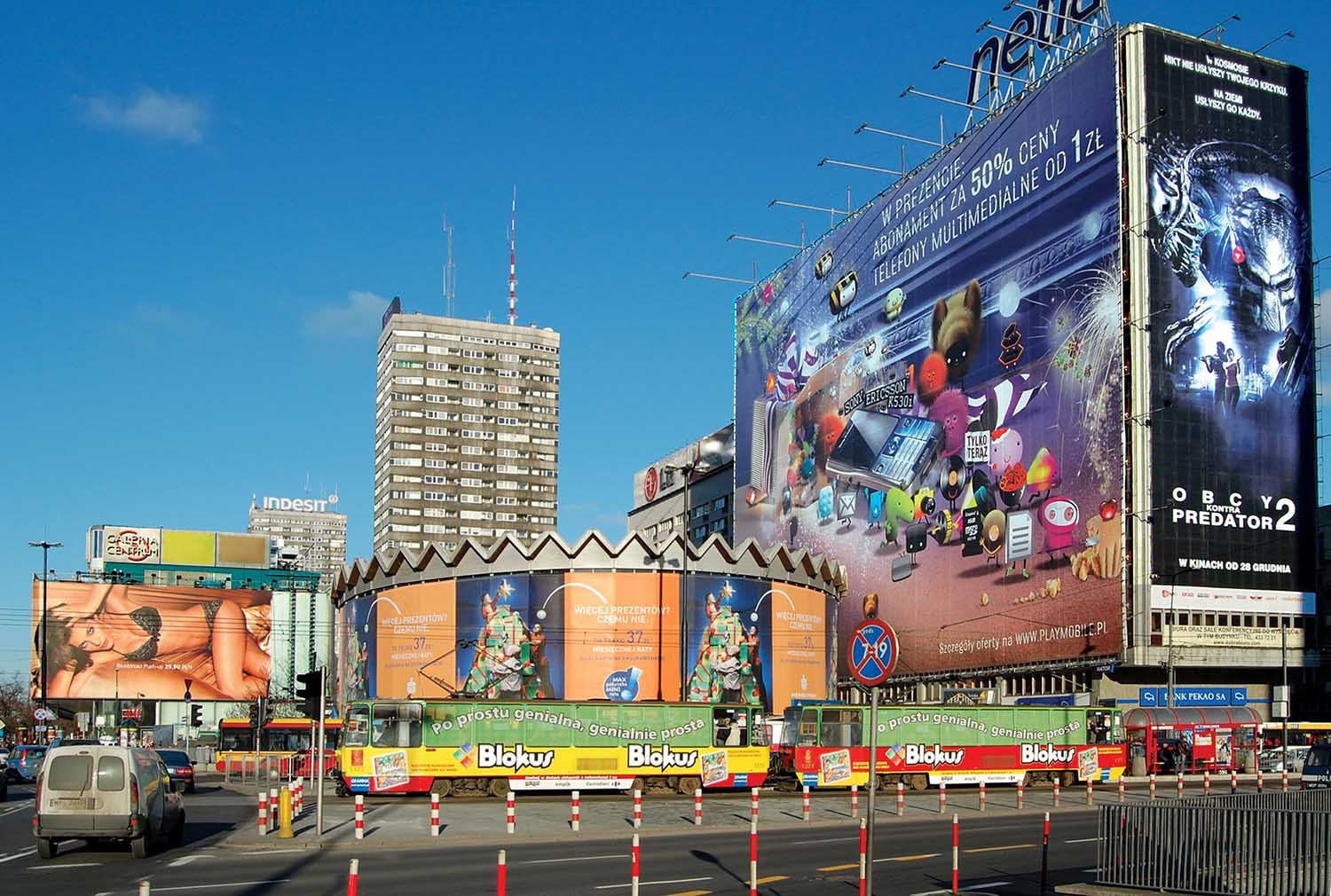
They say that good design doesn’t make itself visible, so you don’t notice it, whereas you will immediately notice bad design. I’ve been wondering if the same applies to typography in public spaces, i.e. whether the well-designed signs are indeed so invisible (the fact that the bad ones are only too visible, is something I have no doubts about. In my own city, Warsaw, the clutter of awful posters, ads and shops signs is frequently subject of protests, and I myself signed a campaign against illegal billboards marring the city centre (there’s an interesting article about how uncontrolled advertising turns the city into a caricature). Despite the fact that so many people graduate from graphic design courses each year, and that the internet provides access to examples of beautiful design, there is still a shortage of good typography in public spaces.

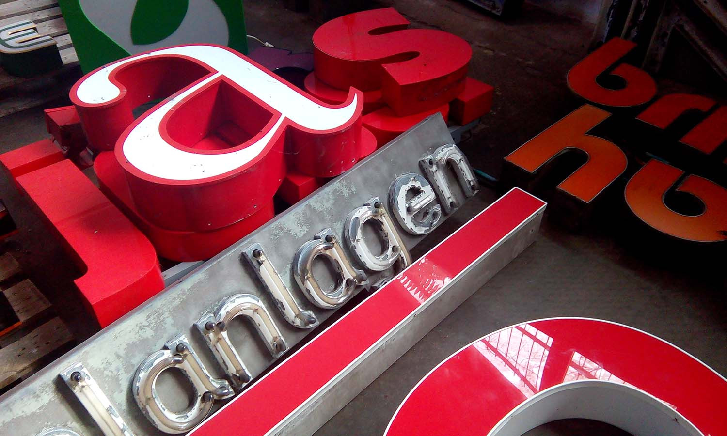
Furthermore, just as hand-painted signs got replaced with much cheaper vinyl-cut ones (something I wrote about a while ago), the same process is happening to traditional neon signs. Storefront is therefore becoming increasingly standardised, family run businesses are packing up, and the distinctive signage of the past century is slowly disappearing from cities. This sad process doesn’t go entirely unnoticed though, for there are many typography fans, who are making efforts to at least preserve the old signs which would otherwise end up in a skip, by collecting them, restoring and turning into a collection. Two of these places I’ve recently visited were Neon Museum in Warsaw (which is part of Top 10 on Trip Advisor) and Buchstabenmuseum in Berlin.
Located on the corner of Claudiusstraße, next to the S-Bahn station Bellevue and U-Bahn station Hansaplatz, where the museum has moved early this year, the Buchstabenmuseum is still in the process of organising its permanent display, which is why I was told that the ticket I bought on my visit will be valid throughout next year. The work-in-progress state means that a lot of the signs are in storage, most of them aren’t lit and apart from the entrance, there is no information regarding the origin of each sign. However, the lovely staff working at the museum are more than happy to go around, briefly turning on each sign to show its colour, and tell a bit about its story. Thanks to their help, my friend and I learned that the large letter E located in one of the further rooms, was used in Tarantino’s Inglourious Basterds (2009) as part of its set design (which becomes obvious when you go around and see the back of the letter) and was a gift from the director to the museum.


There is a great variation in terms of typefaces as well as the materials, including delicate wood and robust steel. Also, the museum has its own font, made from selected museum objects (it can be downloaded for free from the website). I look forward to visiting the museum when it’s ready, and finding out more about the individual signs, especially if they gather more stories like those presented in the foyer, where a few authors describe how they got the be owners of some of those old signs and letters. Jürgen Huber, professor for typography at the FHTW in Berlin, recalls his “rescue” story:
l no longer remember exactly when it was I noticed that a change was taking place sometime at the end of the nineties, when Lichthaus Mösch moved from the Tauentzienstraße in Berlin to the Stilwerk in the Kanstraße, which was new back then. lt was the special offers and the window displays, which were growing empty, that heralded the change. The following day l rang up and was told that Lichthaus Mösch was moving. l wanted to know what would happen to the wonderful shop sign and at first the woman on the phone seemed to have nothing against me having the letters. However, after a little, while she stopped and began to backtrack. “Actually, no. It all sounds a bit odd. So, you want the letters, hmm? Could you send me a fax perhaps, and explain what it is you want, so that I’ve got it in writing?” So l explained in the fax that I was a typographer, that having an interest in fonts was part of my job and that I was keen to have the neon letters for my in home. Finally I got a call: Yes, that would be fine, Mr So-and-so would be there to switch off the fuses, we would have to bring our own tools and “take everything with us, leaving nothing unsightly behind.” They were talking about the Ö.
On the date agreed, we unscrewed the letters early in the morning before work, and brought them home in several trips in Gregor Ade’s little car, where they remained, dirty and smelly, for weeks. The pigeons evidently found them as attractive as we did, if for different reason. Afterwards, we shared the letters between friends and acquaintances, though mainly with designers, as most other people wouldn’t see the point in filling their homes with unwieldy lumps of metal. Until we moved in 2011, I still had an L, an H and the Ö. What’s happened to the Ö is obvious. I kept the neighbouring S. It’s currently hanging in my seminar room at the University of Technology and Economics In Qberschoneweide. The lab engineers Rainer and Norbert hung the S up just below the ceiling, upside down at first. As a font designer, however, the response “don’t worry, no one’ll notice” didn’t sit well with me. It’s been hanging there for nearly three years now – the right way up too. I hung it there to remind me of the expressive Lichthaus Mösch font, of the fun I had with Gregor Ade rescuing the letters, and of early days in the business. Now the S has become a classroom decoration and an inspiration for my students. As a typical example of a slab-serif linear antiqua typeface, it’s also great presentation material, but most of all it’s one thing: beautiful!
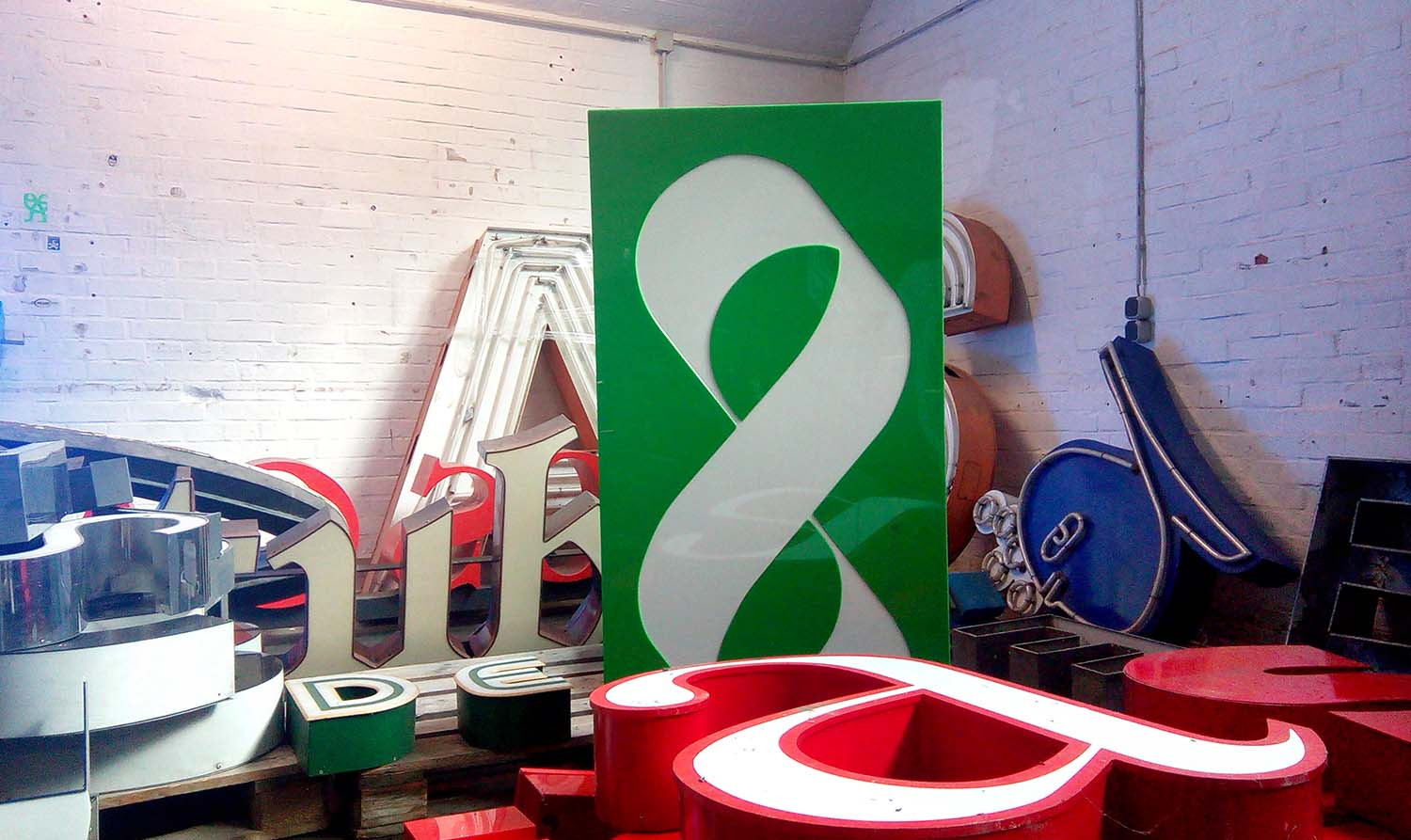

With its beautiful display and an attractive location in Soho Factory right in the middle of the artistic and edgy Praga district, the Neon Museum is a serious competitor to Buchstabenmuseum, for it is currently the largest museum of its kind in Europe, and was set up around the same time as the Berlin one, in 2005. It’s also very tightly linked to our turbulent history, which makes it even more interesting.
The first neon in Warsaw (the “Philips neon”) was lit in 1926. Few neons made it through the second world war, but after Stalin’s death in 1953 the country experienced a boom of creative expressionism. Neon signage was meant to bring excitement and glamour to the cities devastated by the war, which were slowly being rebuilt, and break away from the gloomy Stalinist era. The year 1956, when Władysław Gomułka became the First Secretary of the Polish United Workers’ Party, marks the beginning of a “Neonisation” programme, while the true “golden age of neon” was the 1960-70s. In the 50s, as we can read at the museum, “the idea behind neonisation was (…) to turn Warsaw into a modern European city. Neons were intended as decorative elements, appropriately merged with the urban environment, in harmony with its architecture. The designers of neons were brilliant artists, architects and graphic designers. In their projects, they enciphered their pre-war graphic inspirations; they referenced a period during which creating signs and advertisements turned from craft into art.”


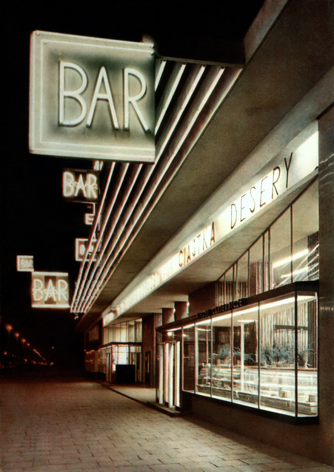

However, after the later turbulence: the Martial Law implemented on 31 December 1981; he Solidarity movement formed as a reaction to the authoritarian government’s violent politics, and the formation of a new government in 1990 in the newly formed Republic of Poland, neon signs were looked down on, considered remnants of the communist system, and therefore many of them were destroyed. Directors of the Neon Muzeum, David Hill and Ilona Karwinska, as well as other typography aficionados, are putting significant efforts to preserve the ones that escaped the post-socialist cleansing.
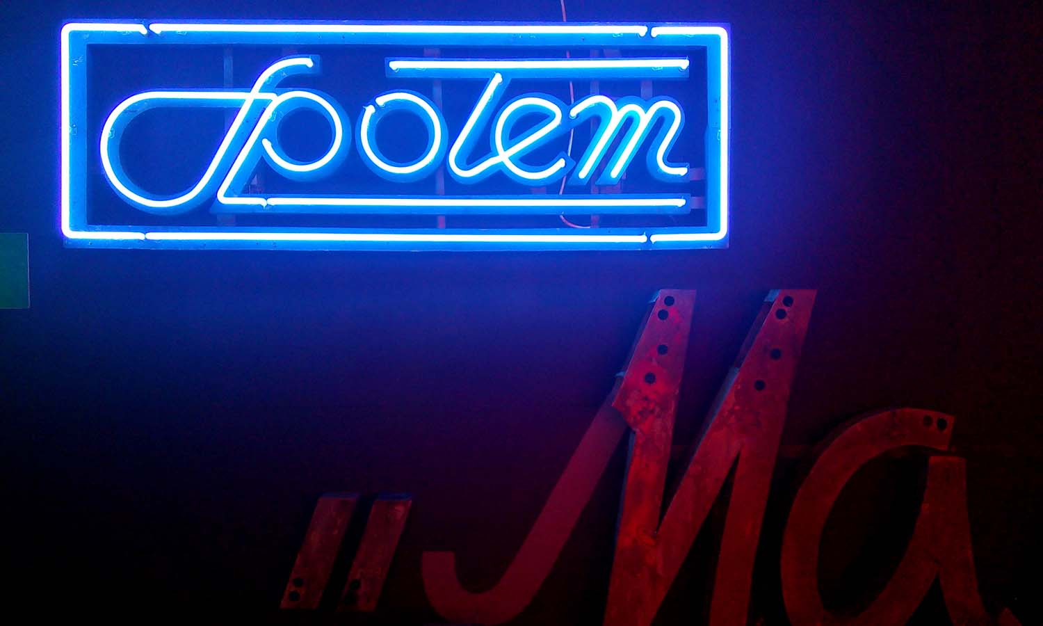

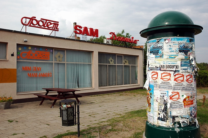
There’s a lot more to keeping neon signs than using them as a piece of furniture in one’s hipster flat. Neon letters are like rare and exotic species of parrot that are in danger of extinction and therefore need to be preserved. Unless we want to live in a world where the efforts to minimise the cost of sign production and increase their legibility will lead to homogenised urban typography, where shops, streets and cities blend into one another, we need to join those typographers in preserving old neons. And start paying attention to the relics of the past left in the skip.
Further reading:
Pismo w przestrzeni publicznej (PL)
Warsaw Neons
Old neon signs in Poznań
The History of Typography and Place
Vernacular Typography