Show & Tell [Part #2]
Date : Wednesday 05 March, 2014
, oil on canvas, 50x60cm")
A month after the first Show & Tell, the time has come for the second part. February was all about painting and parading with oil-stained hands and dirty fingernails concealed underneath black varnish. The time went quickly, as it always does when one gets immersed in such intense work as painting. Today I would like to share elements of that process: the challenges, the discoveries and the joys of working on a brand new series of paintings which will be part of a short graphic novel.
When I was studying foundation at Camberwell College of Arts, one of my tutors, Kaori, once said: “Don’t throw away your foundation sketchbooks for you’ll be coming back to them.” She was right. These new paintings draw inspiration from my two foundation projects: another painting series called Childhood and an installation project about my grandmother (including the portrait below). With both of them, I felt that they should have been taken further than they were (especially the latter, during which I got mumps and spent 10 days in bed). Now, several years later, having embarked on my first comic, I have found a perfect opportunity to revisit both projects and push my ideas as far as possible.
, oil on board, 62.5x83cm")
The experience of working on this series was totally different from anything else I painted before. First of all, I had a complete set of sketches from the draft comic strip, so even though there was a fair amount of experimentation with colours, textures, and brush strokes, as well as changes to the compositions, I knew what I was going to do. On the other hand, the challenge was that the paintings would vary in style which I was confident would be clear and justified in the book but I had to make sure it would work outside of it when the paintings are hanging at the Gasoline Rooms gallery. To help unify the language, I decided to keep the colour palette fairly limited, the main colours being: Prussian blue, ultramarine, indigo, emerald green, turquoise, cadmium orange and various shades of grey. I must say that even though I rarely wear colours myself, I absolutely adore bold colours in painting, and so I tried to push myself here to make colour statements, like on The Magic Mountain painting.
, oil on canvas, 70x100cm")
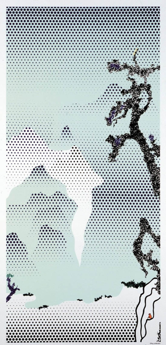
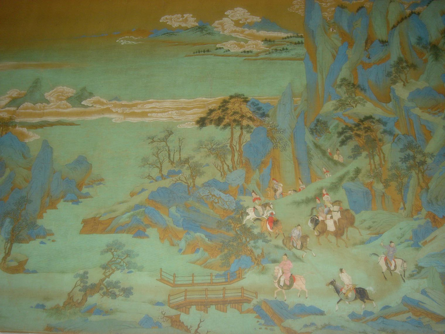
As always, before I began painting, I had been looking at various books and artists. The key images that inspired my palette and compositions were Chinese paintings from the Ming Dynasty (such as Emperor Minghuang’s Journey to Sichuan), Egon Schiele’s Field Landscape (Kreuzberg Near Krumau), Dave McKean’s drawings from Grant Morrison’s Arkham Asylum, Roy Lichtenstein’s late landscapes in the Chinese style, and, of course, Francis Bacon. Perhaps the inspiration I have taken from them might not be visible to anyone but me but looking at those images, alongside listening to very specific musicians and bands, helped me create a certain atmosphere and mood.
")
Another challenge was establishing the level of realism I was going for. Since the story is told by a child whose memories are at times quite hazy and distorted, I aimed for a certain level of surrealism. At the same time, knowing that very soon I will be drawing lots of frames with the girl and the grandmother, it was important to keep their features more or less consistent so that the future reader will be able to immediately recognise them. Therefore, the portrait elements are the only realistic parts of the paintings which in general have a strong surreal feel to them.
, oil on canvas, 40x30cm")
On top of that, since one of the main theme of the story is a game of cards, the card imagery is intertwined with the main storyline and its symbols are present in various places. I must say that I have always been on the “representational” side, steering away from abstract, but I have recently started shifting towards straight lines and angles and areas of flat colour. This is hardly surprising given that my favourite style in architecture and design is Art Deco, but I never had an opportunity to explore geometry in painting. Here, the very graphic and bold paintings such as the Queen of Spades triptych (below), are from the end of the comic, where they no longer represent objective reality but the narrator’s subjective vision of it. My attitude towards applying styles to painting comes from a visual storytelling point of view where the style has to help convey the story so it is dependent on the subject, not the other way round. To put it differently – I don’t see myself as a fine artist who paints a bunch of lines for the sake of it.
 sketches and final paintings")
All nine paintings were completed within a month. I had purposefully given myself such a short time frame because I wanted to work simultaneously and energetically, and minimise the tendency to overdo things. I had cancelled all commitments, quit Facebook, had next to zero social life and I literally locked myself in the flat and spent 4 weeks painting ceaselessly. I discovered that as the canvases were gaining shapes and colours, it was easier to work and make decisions as I was more and more thinking about the whole set rather than each individual painting. Some of them underwent several changes before I was happy, while others were more straight-forward to produce. Of course, the question “When is a painting ready?” is even more perplexing and difficult to answer when you’re dealing with a certain level of abstraction. But there came a point, as well as an informal deadline I had given myself, when, using all the possible willpower to resist the temptation to keep correcting, I forced myself to put the brushes down, throw my disposable palettes away and say out loud: “I’m done.”
The exhibition The Hour of the King — Stories of the Lost runs from 3rd to 27th April at Gasoline Rooms gallery in East London, all details on the flyer below.
")